

Identity · Product · Illustration

Canarie Prep
Brand kit.

The colours, characters and design details that make Canarie feel like Canarie.

Download product logo

Working brand reference. Usage recommendations are labelled throughout.

CanarieOriginal character artwork
01

Brand overview

Name: Canarie Prep. Use this spelling and capitalisation in product and school communications. Use Sam for the AI speaking-practice character.

Audience: Schools, universities and language centres; teachers and their IELTS learners.

Short description: Canarie Prep helps schools support IELTS preparation across Listening, Reading, Writing and Speaking, with guided practice and AI feedback.

Personality: Friendly, clear, encouraging and practical. Learning should feel approachable; the next step should be easy to understand.

School call to action: “Book a school demo”.

02

Logos

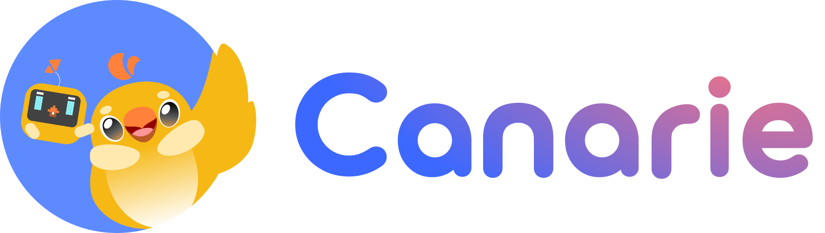
Canarie Prep product lockup

Canarie Prep product lockup

The complete product lockup: original wordmark, mascot and “Prep” arrangement. It includes a white background; place this asset on a white surface.

Download SVG

Canarie family logo

Canarie family logo

For family-level identity. It does not replace the complete Canarie Prep product lockup when the product name is required.

Download SVG

Recommended usage

  • Use the supplied SVGs at their original aspect ratios. Keep their existing colours, gradients and internal spacing.
  • Keep a clear area around the logo. A practical starting point is one quarter of the full lockup height on each side; check the result at its final size.
  • Keep “Prep” legible. Inspect small exports individually.
  • Place logos on calm, high-contrast surfaces. Use a white panel if the background is busy.
  • Do not stretch, redraw, recolour, add shadows, rotate individual parts or retype “Prep” next to the mascot. Do not crop the mascot out of the full lockup to create a new one.
03

Colour

Canarie blue#5D8AFF
Warm gold#FFCC66
Brochure cream#FAF8F4
Deep navy#071769

Marketing and brochure palette

Use this palette for marketing, the brochure and new brand communications. #5D8AFF is the Canarie logo blue.

ColourHexRecommended role
Canarie blue#5D8AFFBrand fields, hero artwork and prominent graphic accents
Warm gold#FFCC66Highlights, welcoming accents and primary actions with dark text
Brochure cream#FAF8F4Spacious editorial backgrounds
Deep navy#071769Headings and dark text on blue; shared with the app
Ink#151515Reading text; shared with the app
White#FFFFFFLogo panels and clean surfaces

Application tokens

Light-theme values used by the Canarie Prep app. Reuse these tokens when working on product screens.

Token / roleHex
--color-primary#FFCC66
--color-primary-hover#E6B85C
--color-secondary#071769
--color-secondary-light#1A2B7A
--color-brand-blue#3B5CCC
--color-background (app)#F6F3EC
--color-text#151515
--color-text-muted#404040
--color-accent-orange#F67D37
--color-accent-green#07B68B
--muted#E8E5DE
--border#D4D0C8
--destructive#EF4444

Keep the distinction: marketing blue #5D8AFF and app blue #3B5CCC have different uses. Likewise, brochure cream is #FAF8F4; the app background is #F6F3EC.

Readable pairings

Calculated WCAG contrast for solid colours. Normal text needs at least 4.5:1 for AA; large text needs 3:1 (24 CSS px regular, or about 18.7 px bold).

TextBackgroundContrastUsage
Navy #071769Canarie blue #5D8AFF4.90:1Normal text AA
White #FFFFFFCanarie blue #5D8AFF3.21:1Large text only; avoid for small labels
Ink #151515Gold #FFCC6612.24:1Normal text AA
White #FFFFFFApp blue #3B5CCC5.85:1Normal text AA
White #FFFFFFNavy #07176915.72:1Normal text AA
Ink #151515App cream #F6F3EC16.48:1Normal text AA
Muted ink #404040Brochure cream #FAF8F49.77:1Normal text AA
Ink #151515Green #07B68B7.02:1Normal text AA

White on green #07B68B is only 2.60:1. Prefer dark text.

04

Typography

Primary typeface

Nunito

ABCDEFGHIJKLMNOPQRSTUVWXYZ
abcdefghijklmnopqrstuvwxyz
0123456789 & ? !

Regular 400Bold 700Black 900

Nunito is the primary typeface, loaded in weights 400–900. Mitr sets all Thai text.

Thai typeface

Mitr

เตรียมสอบ IELTS ที่เดียวจบ

กขฃคฅฆงจฉชซฌญฎฏฐฑฒณดตถทธนบปผฝพฟภมยรลวศษสหฬอฮ
ะ า ำ ิ ี ึ ื ุ ู เ แ โ ใ ไ ่ ้ ๊ ๋ ๑๒๓๔๕

กขค 300กขค 400กขค 500กขค 600กขค 700

Mitr (Cadson Demak, SIL Open Font License) sets Thai text, weights 300–700. Nunito stays first in every font stack, so English, numbers and punctuation render in Nunito and only Thai glyphs fall through to Mitr. Mitr reads heavier than Nunito, so Thai pages step weights down: body 300, bold 500, headlines 600. Noto Sans Thai Looped is the fallback.

Suggested hierarchy

RoleSizeWeightLine height
Display headline48–72 px, responsive9001.05–1.15
Section heading28–40 px700 or 9001.15–1.25
Body16–18 px4001.5–1.65
Label / caption13–14 px400 or 7001.4–1.5

Keep long text around 60–75 characters per line. Use sentence case. Load the actual weights used; do not simulate bold.

Specialist faces

TypefaceRole
Sometype Mono, 400–700Speaking boarding pass and its result-card typography
Press Start 2P, 400Sam’s pixel-style Part 2 preparation countdown
Libre Barcode 39 Text, 400Boarding-pass barcode, including its readable text
JetBrains MonoTechnical / monospaced type

Specialist fonts serve specific components. Do not rebuild the logo with a similar-looking font.

05

Characters

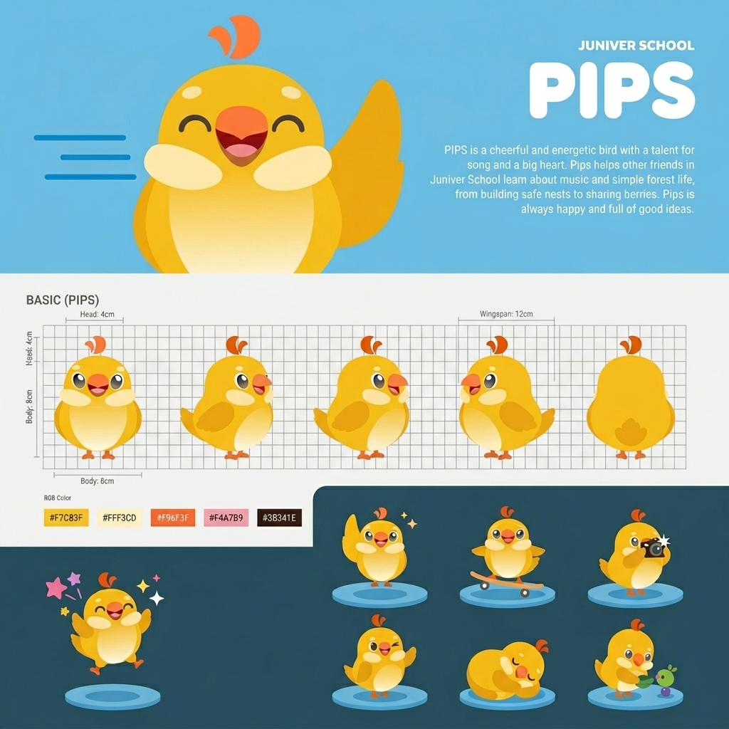
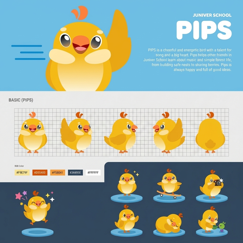
Character references take priority over scene references. Preserve the original designs when changing a pose, expression, setting or prop.

Canarie

Canarie
  • Small, round, chubby golden-yellow body with the reference silhouette and proportions.
  • Cream belly and elongated cream cheek/wing patches.
  • Large oval dark eyes with white highlights and a warm lower-eye gradient.
  • Orange beak and the original two curved orange crest shapes.
  • Short rounded wings and tiny orange feet where visible in the chosen pose.
  • Simple 2D treatment with restrained gradients from the source artwork.

Do not turn Canarie into a generic chick, realistic bird, humanoid mascot or glossy 3D character. Do not add fingers, extra wings or extra limbs.

Sam

Sam
  • Compact rounded-square warm yellow body, with subtle depth beneath the body.
  • Charcoal rectangular face screen.
  • Two cyan vertical eyes with white bars above them.
  • Small orange pixel-style plus/cross in the centre of the face.
  • Cream rounded side arms.
  • A thin dark curved head stem ending in two separate orange triangles.

Keep the head detail exact. Do not substitute a flag, ball, feather, leaf or straight antenna. Do not add humanoid legs or generic robot features. Sam supports examiner-style speaking practice; the character is not an official IELTS examiner.

06

Illustration

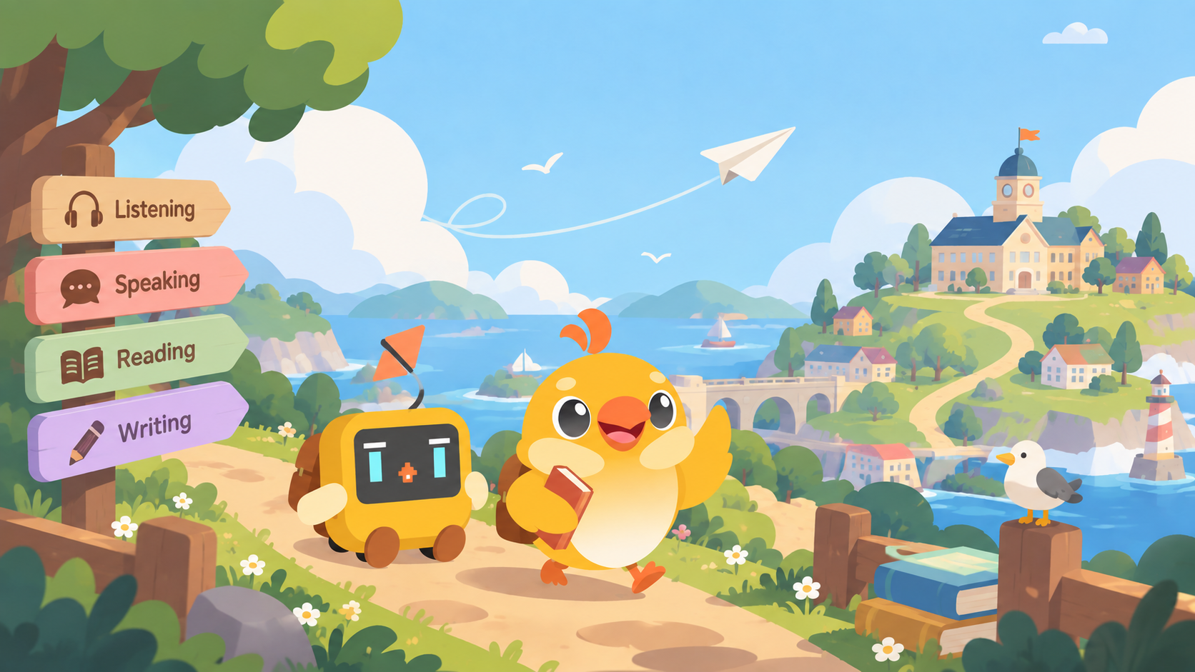
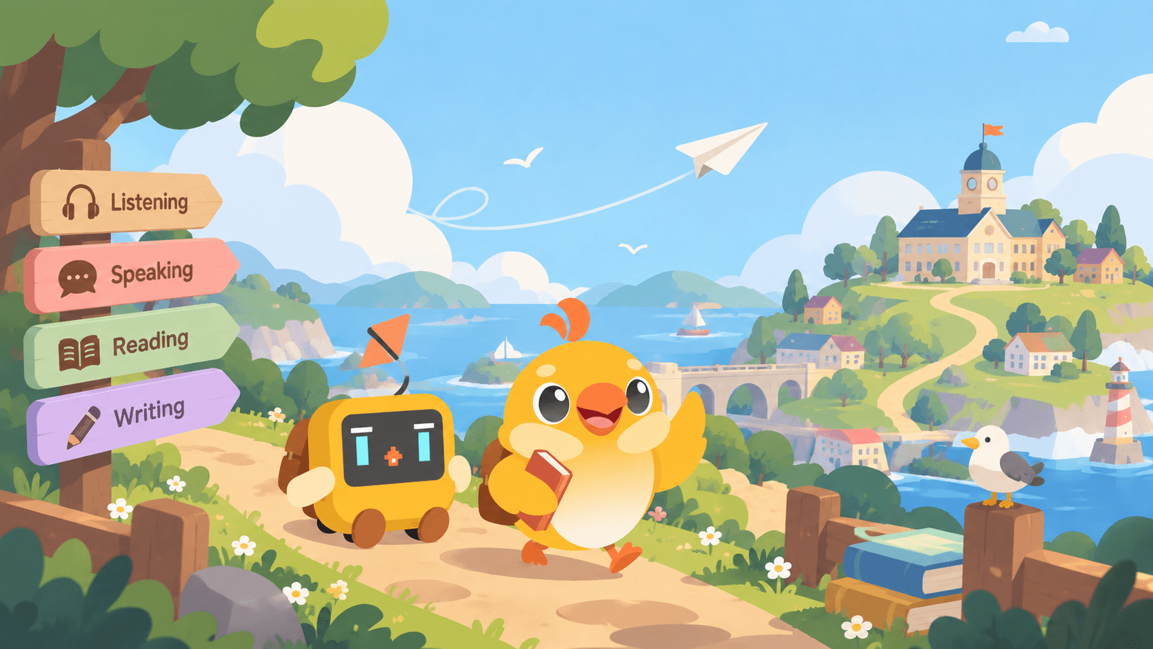
Coastal learning-world style reference

Use this image for environment, atmosphere and composition. Use the separate character references for anatomy and identity. Where the scene differs from those references, the character references win.

The visual language is cheerful, polished 2D illustration with rounded forms, clean edges, soft storybook shading and gentle depth. Use sky blue, sage green, cream, warm yellow and orange, with occasional muted pink or lavender.

Learning-world motifs include paths, books, islands, bridges, arches, school buildings, flowers and paper planes. The lesson journey can use simplified isometric paths and architecture. Keep the artwork original.

Recommended composition

  • Give each graphic one clear learning idea: Listening shows audio and attention; Reading, passage and evidence; Writing, draft and revision; Speaking, conversation with Sam.
  • Vary framing, scale, props and viewpoint across skill pages. Avoid repeating the same character-and-island composition.
  • Balance graphic weight with text. Leave purposeful space for headings and captions.
  • Preserve the requested setting. An indoor study scene does not need a coastal background.
  • Keep artwork text-free by default. Add real, editable typesetting in the final layout.

Avoid photorealism, glossy 3D rendering, neon palettes, noisy clip art, malformed limbs and invented typography.

07

Interface and layout

Style specimen

Ready for your next step?

Practise one skill. Review your feedback. Keep learning at your own pace.

Start practice
Canarie

Foundations

Cream backgrounds, white surfaces, gold primary actions, navy/blue accents, Nunito and rounded corners. The base radius is 1rem (16 px).

TokenRadius
sm12 px
md14 px
lg16 px
xl20 px
2xl24 px
3xl28 px
4xl32 px
5xl40 px

Recommended application

  • Make one action visually dominant. Use dark text on gold, and keep focus indicators visible.
  • Use a consistent 4/8 px spacing rhythm; allow more breathing room around editorial sections.
  • Use a clear heading, a short explanation and a useful graphic before adding detailed text.
  • Keep icons simple and rounded, with consistent stroke weight. Pair unfamiliar icons with labels; do not make colour the only indicator of status or skill.
  • Preserve keyboard access, readable contrast and reduced-motion preferences. Avoid decorative motion during focused practice.
08

Voice and copy

Speak to learners with encouragement and a concrete next step. Speak to schools with clear benefits and accurate descriptions of what the platform provides.

SituationSuggested wording
School introduction“Support IELTS preparation across all four skills.”
Sam introduction“Meet Sam, your AI partner for examiner-style speaking practice.”
Feedback“Your main point is clear. Add one example to develop it.”
Retry“Try again when you’re ready.”
School action“Book a school demo”

Avoid guaranteed bands, vague superlatives, or claims of official IELTS endorsement. Describe AI band scores as practice estimates.

09

Assets

Original assets, unchanged. Download and use them as supplied.

AssetUse
Product logo (SVG) Complete Canarie Prep lockup
Family logo (SVG) Canarie family identity
Front pose Canarie identity reference
Wave pose Original Canarie pose
Wings pose Original Canarie pose
Model card 1 Full character guidance
Model card 2 Full character guidance
Sam reference Sam identity reference
World reference Environment and atmosphere

Nunito is licensed under the SIL Open Font License 1.1 and available from Google Fonts.